Hi there
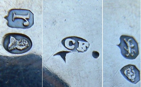
I am new to the forum, so let me introduce myself. My name is Theuns and I own a coins and collectibles shop in Cape Town, South Africa. We buy all kinds of collectible items, and frequently buy silver. I thought I knew quite a bit about silver marks, but I am stumped by the marks on the silver jug that we recently aquired. The jug was obviously made by Charles Thomas Fox of London. However, I’m confused by the date:
- The maker’s mark (CF in the oval) was only used 1839 to 1840.
- The leopard’s head and duty mark signify a date in the 1820s and 30s.
- The date letter r is obviously the letter from 1792, rather than 1832.
Am I missing something obvious? Any help will be appreciated.
Regards
Theuns
PS I cut the picture to fit in the maximum of 500 pixels, hence the white lines.
Welcome to the forum, Theuns.
I think that I can remove any confusion. First the date is definitely 1832 simply because, as you note, the leopard’s head is uncrowned. The “r” date letters for 1792 and 1832 are practically identical in form so the leopard’s head and duty mark are the only real way of distinguishing them.
I guess that you may have got the 1839-1840 dates for Charles Fox from my site devoted to makers’ marks. The dates are not working dates; I try to explain in my introduction that the dates are those for which I, personally, have seen this particular silversmith’s mark used. For this entry I have included the information that the mark was registered in January 1823 and then again in 1838 so you could see it for a much wider date range than I have previously done so (I can now add 1832 as a new earliest date seen).
I hope this helps you.
Hi there
Sorry for the late reply. Thanks so much for clarifying the date. I see now that the pictures of the “r” for 1792 and 1832 on www.925-1000.com look very different. The one for 1792 looks exactly like the one in the picture that I uploaded (a flat top with a very pronounced drop-like round serif), while the one for 1832 has angled top with a arrow-shaped (angled) serif. Maybe it’s just the resolution that’s interfering with the quality of the lettering.
Anyway, thanks again.
Regards
Theuns