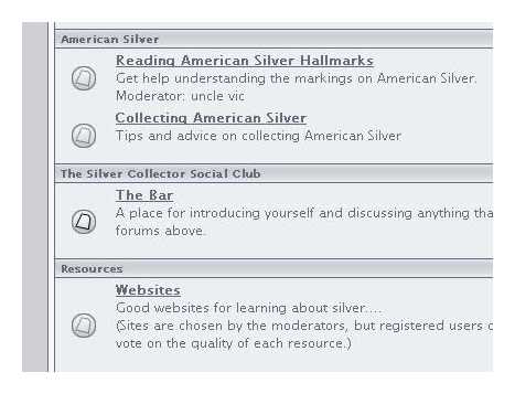
Is there some subtle point to making the active topic icons on the home page so difficult to see? Separating out the blind mice or just stylistic swagger?
Hi Wev and welcome. I have to say that I have never had difficulty sorting out the active forums from the inactive. I agree that the difference is a little subtle, but it fits in with the site’s overall colour scheme. This is what I see when there is an active topic in a forum:

If you have any suggestions perhaps we can bring this thread to the attention of the site webmasters.